Bitcoin Drawdown Risk Across Market Regimes
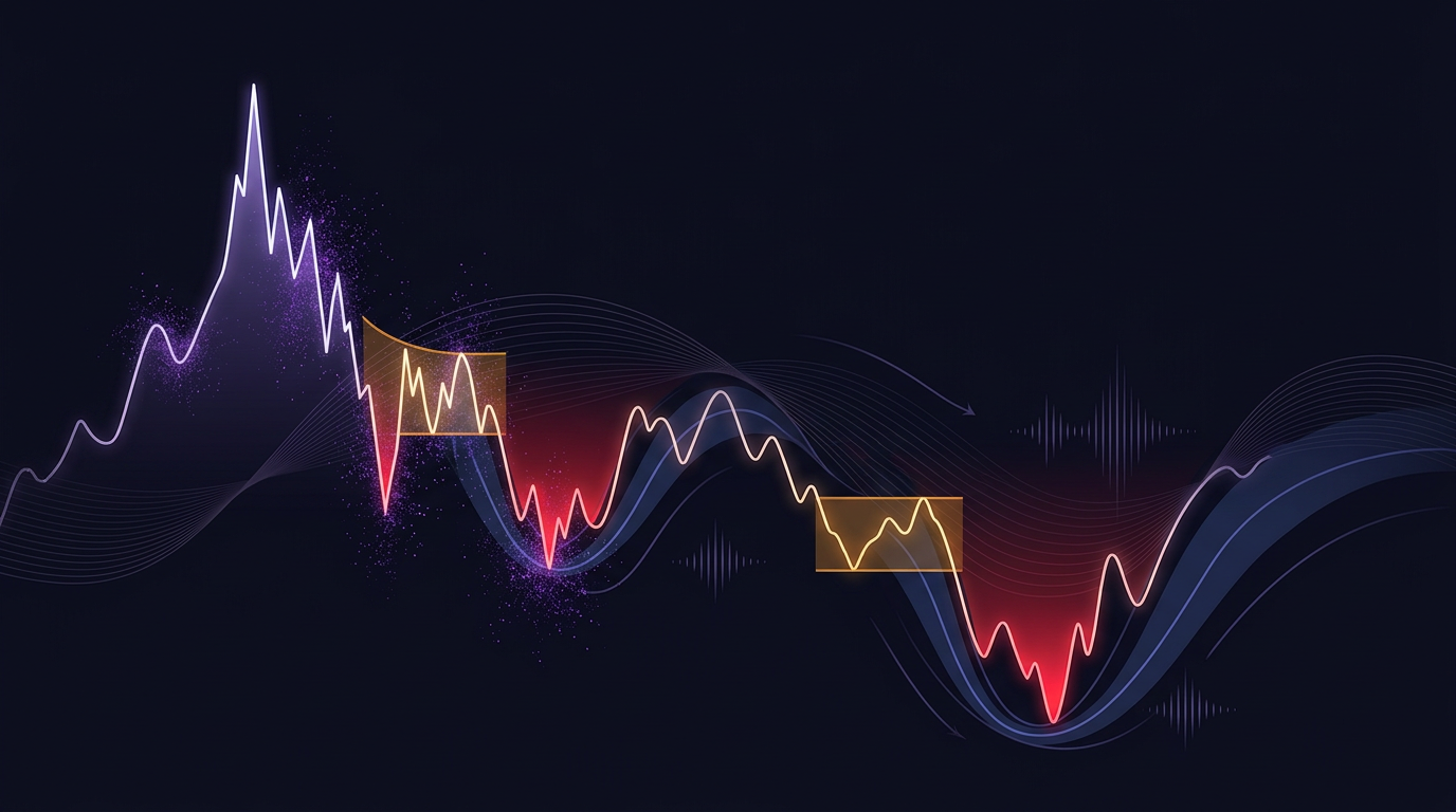
What bitcoin drawdown risk actually measures
Bitcoin drawdown risk is not a single percentage printed under an all-time-high chart. It is the combination of how far price has fallen from a prior peak, how long that loss has lasted, how long it has taken to recover, and whether that path is occurring in a calm, volatile, or crash-like market state. Many public charts stop at percent from ATH. That number is an observation of a realized path, not a complete risk statement and not a forecast of the next low.
A peak-to-trough loss answers one question: from the highest close (or high) in a chosen window, how large was the subsequent decline to the lowest point before a new peak? Maximum drawdown is that worst peak-to-trough loss over the sample. Current underwater status is different: it is the live distance from the most recent peak, even if that peak is not the all-time high and even if a deeper trough already occurred and recovered.
Those distinctions matter because two portfolios can share the same ATH drawdown while having different duration, different recovery clocks, and different volatility around the path. Regime context is what turns a chart into a risk framework rather than a scoreboard.
Depth, duration, recovery, and underwater status
Treat four quantities as a set, not as substitutes.
Depth is the percentage decline from a defined peak to a defined trough. Specify the peak rule (all-time high versus rolling window high versus cycle high) before comparing numbers. An ATH drawdown and a 90-day rolling drawdown are not the same object.
Duration is the time spent from peak to trough, or more usefully the time spent below the peak. A fast 30% air-pocket and a slow 30% grind can produce the same depth with different operational stress: margin calls, rebalancing rules, and psychological capacity all depend on time as well as size.
Time to recovery is the clock from trough back to the prior peak (or to a new high, if that is the rule you chose). Recovery time is not implied by depth. Shallow losses can linger; deep losses can reverse quickly. Without a recovery definition, drawdown history is incomplete.
Current underwater status is whether price is still below the chosen peak and by how much. It is an observation of the live path. It does not, by itself, say whether the next move is lower, sideways, or a new high.
A measurement workflow (illustrative example, not a proven method)
The following is an illustrative example of how a notebook might be organized. It is not an empirical fact, not a universal rule, and not claimed to be optimal.
1. Fix the peak definition: ATH, trailing N-day high, or regime-local high. 2. Record depth from that peak to the subsequent trough and to the latest close. 3. Record calendar days below the peak and days from trough to recovery if recovery has occurred. 4. Repeat the same four fields on a rolling window so a new ATH is not required to see risk. 5. Place those fields next to a regime label and a volatility measure, without treating any field as a prediction.
Do not describe any resulting value as normal, elevated, extreme, or crowded unless you have a documented historical percentile for that exact series. This article does not supply those percentiles.
Why the same percentage is not the same risk in every regime
A 25% decline in a low-volatility grind, a 25% decline in a high-volatility trend, and a 25% decline in a crash-like gap regime can share a headline number while differing in path, liquidity, and recovery clock. The percentage is an observation of price. Interpretation is about the state in which that price path occurred. Prediction of the next state is a separate claim and is not justified by the drawdown figure alone.
Market regimes are useful here as a classification of conditions—trend, chop, expansion, compression—not as a promise that history will repeat. For a definition of regime language in crypto, see what a market regime is in crypto. For why Bitcoin is often described with more than a simple bull/bear/chop label, see Bitcoin’s five market regimes versus the bull-bear-chop model.
In a compressed, low-range state, a given percentage may arrive slowly, with overlapping candles and frequent mean reversion. In an expanding-volatility state, the same percentage may arrive in fewer sessions, with wider gaps between successive lows. In a crash-like state, the path may be dominated by discontinuous prints rather than a smooth slide. Those are qualitative distinctions about mechanism of the path. They do not license a claim that one regime always produces larger or smaller future losses.
Bitcoin’s price history is mixed across different market states. Historical average drawdowns, even when carefully computed, are samples from mixed regimes. Using a single average as a sizing constant treats mixed history as if it were one distribution. That is a limitation of the sample, not a forecasting feature.
Rolling realized volatility versus a drawdown chart
A drawdown chart is a function of the cumulative price path. Rolling realized volatility is a function of recent return dispersion. They overlap but are not redundant.
Drawdown can remain large after volatility has already compressed, because the peak is still far above the current price. Volatility can expand while drawdown from ATH is still modest, because the expansion is happening near highs. Rolling volatility therefore adds information about the recent amplitude of moves, not about distance from a historical peak.
When comparing the two, keep the claims narrow:
- Observation: realized volatility over a window is one number; drawdown from the chosen peak is another.
- Interpretation: the path is currently noisy or quiet relative to that window; the position is underwater or not relative to that peak.
- Prediction: neither series, by itself, states the next crash depth.
Implied volatility and options-based gauges, when available, are still not the same as realized drawdown. They are a separate observation from the historical peak-to-trough path. They can sit beside a drawdown chart. They do not convert a historical maximum drawdown into a guaranteed bound. For one options-facing risk series, see what DVOL says about Bitcoin risk.
Regime-conditioned VaR and expected shortfall as complements, not oracles
Value at risk (VaR) and expected shortfall (ES) summarize the left tail of a return distribution over a horizon and a probability level. Historical VaR uses past returns; parametric VaR assumes a shape; hybrid versions mix both. Expected shortfall asks how bad the tail is beyond the VaR cutoff.
Used without regime labels, these statistics pool calm days with crash days and report one number. Used with regime labels, they become conditional summaries: given the current classified state, what did left-tail returns look like in similar past states? That is still a description of a sample, not a forecast of the next crash.
Complementarity with drawdown:
- Maximum drawdown is path-dependent and can be dominated by one episode.
- VaR/ES over a short horizon can miss multi-week underwater periods.
- Regime-conditioned VaR/ES can show that tail thickness differs by state even when ATH drawdown is unchanged.
- Bitcoin samples are short relative to the number of distinct episodes.
- Classification error in the regime label contaminates the conditional tail.
- A chosen probability level is a modeling choice, not a natural constant of the market.
- None of these tools imply directional capital flow, liquidation risk, or trader conviction from open interest or long/short ratios. Those series answer different questions.
What historical Bitcoin drawdowns cannot do for future sizing
Historical peak-to-trough losses are observations of past paths. They are useful as stress narratives and as a reminder that large underwater periods have occurred. They are weak as a single input to future size for several reasons.
Mixed samples. A drawdown computed over a long calendar window mixes different market states. Treating that mix as one distribution overstates how much the average can say about the next episode.
Limited independent episodes. A handful of large cycle declines is not a large statistical sample. Averaging them hides regime mix and overlapping calendar effects.
Peak definition sensitivity. ATH drawdown, cycle-high drawdown, and rolling-window drawdown will rank periods differently. Sizing off one definition silently ignores the others.
Path versus point. Two histories with the same maximum depth can have different duration and recovery. Capital that must meet a calendar constraint cares about time underwater, not only the worst print.
No implied future bound. Past maximum drawdown is not a ceiling. Treating it as a worst-case guarantee confuses a sample extreme with a structural limit.
No advice from the metric. Drawdown statistics do not tell anyone what to buy, sell, or hold. They describe loss paths. Interpretation of those paths in a portfolio is the user’s mandate, constraints, and process.
A compact framework you can keep next to any ATH chart
A live ATH drawdown widget is one observation. A more complete bitcoin drawdown risk view keeps five columns in the same place:
1. Peak rule (ATH, rolling, cycle). 2. Depth from peak (trough and current). 3. Days underwater and, if available, days to recovery. 4. Rolling realized volatility (and, if you use it, a clearly labelled VaR/ES on a stated horizon). 5. A regime label with an explicit statement that the label is a classification, not a prediction.
A compact checklist (illustrative example, not a proven method):
- Write the peak rule before looking at the percentage.
- Separate current underwater status from historical maximum drawdown.
- Do not convert duration into a this-time-is-different or this-time-is-the-same story without additional evidence.
- Do not infer positioning or liquidations from drawdown alone.
- Recompute rolling metrics when the regime label changes; do not assume the old tail still applies.
- Record what each metric cannot infer, in the same notebook as the numbers.
Questions about whether Bitcoin can collapse, how far a given round-number price is, or why price is dropping mix possibility, price targets, and causal stories. Drawdown risk work answers a narrower set: how deep, how long, how recovered, in what volatility state, with what sample limits. Collapse and round-number questions are not settled by a drawdown formula. Causal why-is-it-dropping questions need drivers beyond the path statistic.
Putting the pieces together without over-claiming
Start with definition: bitcoin drawdown risk is peak-to-trough loss plus time plus state, not ATH percent alone. Add rolling windows so you are not waiting for a new high to measure pain. Place volatility and, if used, regime-conditioned tail statistics beside the path, labelled as complements. Keep observation, interpretation, and prediction in separate sentences. Refuse to treat historical averages as future size, and refuse to treat any single indicator as a winner.
What is missing from a live chart alone is a reproducible way to compare the same percentage across regimes, to include duration and recovery, and to state what each metric cannot say. That is the framework. It does not forecast the next crash, and it does not replace a mandate, a risk budget, or a process for when not to trade.
For related regime-aware process design, see using market regime as a strategy gate and crypto trading bot risk management with regime awareness. Those pieces address when exposure is on or off; this piece addresses how loss paths should be measured while exposure exists.
Share this post
Track Bitcoin's Current Regime
See whether BTC is in a Bull, Bear, Range or Transition regime right now.
View Live Dashboard →